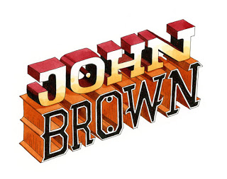
Illustrator and author John Hendrix posted the 'Anatomy of a Jacket' on his Blog Drawing on a Deadline. John discussed the process of making the jacket for his latest book JOHN BROWN:His Fight for Freedom. This entry is a follow-up to his but from the view of the art director. Let's begin.
Usually after most of the interior is underway, do I start asking the illustrator (in this case John Hendrix) to start sketching up cover ideas. Sometimes I will have something in mind that might work. This was not one of those times. I felt that what ever John might sketch up was going to be better than any suggestion I might have. But more importantly at this stage I feared that any direction might stifle his creative process.
Usually after most of the interior is underway, do I start asking the illustrator (in this case John Hendrix) to start sketching up cover ideas. Sometimes I will have something in mind that might work. This was not one of those times. I felt that what ever John might sketch up was going to be better than any suggestion I might have. But more importantly at this stage I feared that any direction might stifle his creative process.
So John began to sketch.
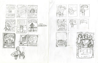
And from there he selected his best sketch
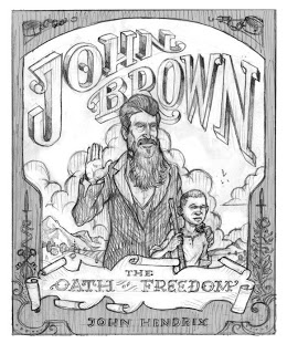
At first glance John's sketch was very impressive and exciting only was it right for the book? I waited a couple of days to see if it was still as exciting. After showing it to the editor Howard Reeves. His concerns echoed my own. That as beautiful of a drawing as it was, for a cover it was to stately and stiff for the book that it is. In addition the subtitle was of some concern "The Oath of Freedom" It leads you to believe that John Brown actually took an oath, which he he did not. Howard and John worked on subtitles that might better suit the story.
My direction to John was simple we need more motion/action. I wanted to feel John Brown's passion. I referred him to pieces from the interior that worked well and captured what I was trying to say.
My direction to John was simple we need more motion/action. I wanted to feel John Brown's passion. I referred him to pieces from the interior that worked well and captured what I was trying to say.
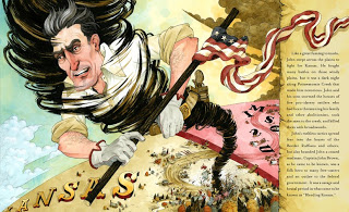
So back to the drawing board.
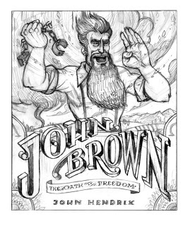 This new sketch compositionally was better than the last, it definitely had action. I loved how the type was developing but now John Brown appeared to be crazy pants rather than a 'hero' . How where we to make him appear to be a 'hero'. At first this was a hard thing to do. mainly because of his beard. It made him look Joaquin Phoenix / Una bomber crazy. This had to change. I suggested thinking of Superman crossed with Moses.
We both seemed excited by this idea but would it work? John went out in search of reference.
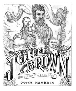
John's next sketch was right on the nose. At this point we worked out a subtitle that better described John's Brown's story, " His Fight for Freedom"

John's next sketch was right on the nose. At this point we worked out a subtitle that better described John's Brown's story, " His Fight for Freedom"
Only one slight change. We needed a girl character. (See below)
Next John stopped by my office where we went over how the whole cover would look. Back cover, flaps, and spine. I wanted to utilize John's typography as much as possible. Type is not something to be place just on top of an illustration. Anything I might have done would look unnatural with his art. I try to make sure that type and illustration live together rather than fighting with each other. I had John work up type for the flaps and spine , well really the whole jacket.

Once the sketch was approved John set out to work on the final. He first looked over the entire book to remind himself of the general color structure. From here I wait until I see the final art. Below are John's studies and process of making the final art
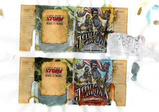
The shield on the bottom of the art needed to be used on the title page as well, in different proportions, so he built all the elements of the cover individually and assembled them in Photoshop.
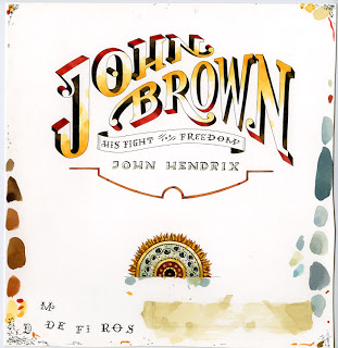
Once the bottom was assembled in place with the flaps and spine, He could lay in the art for the top. Here is the full piece, unobscured by the shield.
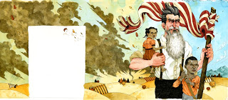
Finally the cover art was done. Next step add Jacket and Flap copy.
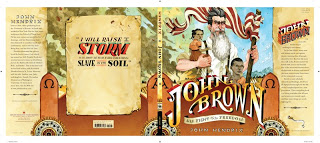
Here is the final front cover.
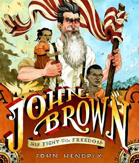 For more about JOHN HENDRIX check out this cool interview.
Also Illustrated by John Hendrix,
Nurse, Soldier, Spy
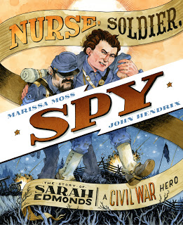
 For more about JOHN HENDRIX check out this cool interview.
Also Illustrated by John Hendrix,
Nurse, Soldier, Spy
The Story of Sarah Edmonds, a Civil War Hero

Illustration © 2009 by John Hendrix.
Published by Abrams Books for Young Readers. New York.
Posted with permission of publisher. All rights reserved.
Published by Abrams Books for Young Readers. New York.
Posted with permission of publisher. All rights reserved.
