I can't believe THE HATERS is now in the world for all of you to read. A little less than a year ago Maggie, Susan, Michael, Will and I were working on the cover design, fresh off the redesigned cover for Jesse Andrews bestselling Me and Earl and the Dying Girl

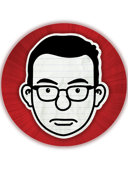
With Me and Earl we established a new author look for Jess: strong bold color, simple and evocative (and funny!) graphics, adult appeal for his crossover audience. But with any series I believe you really begin to understand how your series branding will work on the second book. What works, what doesn't and where you can push each book to be distinct from the last.
A NOTE FROM JESSE ANDREWS:
CWB: Jesse, before the book was delivered to ABRAMS did you have something in mind for the cover image?
JA: With Me and Earl and the Dying Girl, I learned that my instincts for book covers are pretty terrible. I wanted something kind of aggressively depressing, because in the abstract that seemed like a funny and interesting choice to me for a funny book. So I described a hypothetical cover to Maggie Lerhman and it turned out to be—in addition to wildly unappetizing to everyone at ABRAMS—the cover of a book that already existed. That book was about the Columbine shootings.
So this time around I pretty much didn't even let myself imagine what the cover would be because I knew you and Will would come up with some great ideas and I wanted to be open to them. And you did!
Jesse Andrews working away on the final touch of THE HATERS at my desk.
So . . . where do you begin?
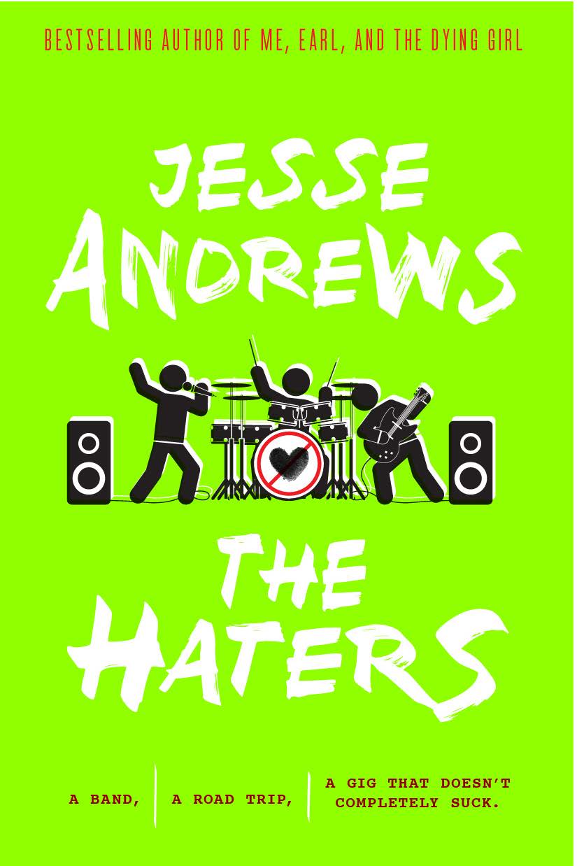
The story, is a good place to start. I like to break down the story into simple concepts first. The Haters is about music, love, friendship, and freedom as three young musicians following a quest to escape the law long enough to play the amazing show they hope (but also doubt) they have in them.
Phew! alot of stuff to work with. So how do we focus? First, hire the best designer you know who is also most familiar with Jesse's work: Will Staehle. He designed Me and Earl and the Dying Girl The next step, talk to him about images that evoke music, band, love, friendship, road trip and freedom.
WHEN YOU CAN FIND SOMETHING TO HATE ABOUT EVERY BAND,
HOW DO YOU MAKE A SOUND YOU LOVE?
Round 1
Below are Will's first round designs. Below each are Will's notes describing what we are seeing. These are the exact notes that he sent me to explain what he was going for. I have also included my immediate take on the comps and the book concept captured.
I have also include my immediate take on the comps in addition to the subject that the comps fell under.
WILL STAEHLE: Roadtrip under a "black-cloud" made of cassette tape guts.
CWB: ROAD TRIP : FREEDOM : I love the Wes Anderson vibe in these road trip comps
WILL STAEHLE: Rock star as pin-cushion / glutton for punishment.
CWB: FRIENDSHIP: Weird and graphic. let's take another look and see if we can make the figure more recognizable as a voodoo doll.
WILL STAEHLE: Bass guitar with three heads of our main characters as the "tuning keys" Could be gold ink or gold foil.
CWB: BAND: Not that exciting.

WILL STAEHLE: Amps bursting into flames felt comical, yet appropriate for the tough luck of our first time touring band.
CWB: BAND: Super interesting and GRAPHIC! but I think we want to cover to be funny like EARL

WILL STAEHLE: All-type solution. Neon-inspired like some of the venues they approach. Central icon is a "NO" sign with added x'd out eyes to create a crooked / smug sort of
CWB: UH? : Too red light disctrict.
WILL STAEHLE: List of band names they go through before settling on The Haters.
CWB: BAND: Interesting but might make a better title page design.
WILL STAEHLE: Being in a band is hard. Like a microphone with brass knuckles adhered to it.
CWB: BAND : I think I am just impressed by Will's rendering of the most bad ass microphone you will see. Henry Rollins would love this! But might be too aggressive for the market.
WILL STAEHLE: Abstract angry face made of amp knobs and a pair of headphones. Kind of a weird cover, but I included it anyways.
CWB: BAND : MUSIC : FRIENDSHIP: Funny! But what's with the big red dot. Reminds me of Mr. Yuck.

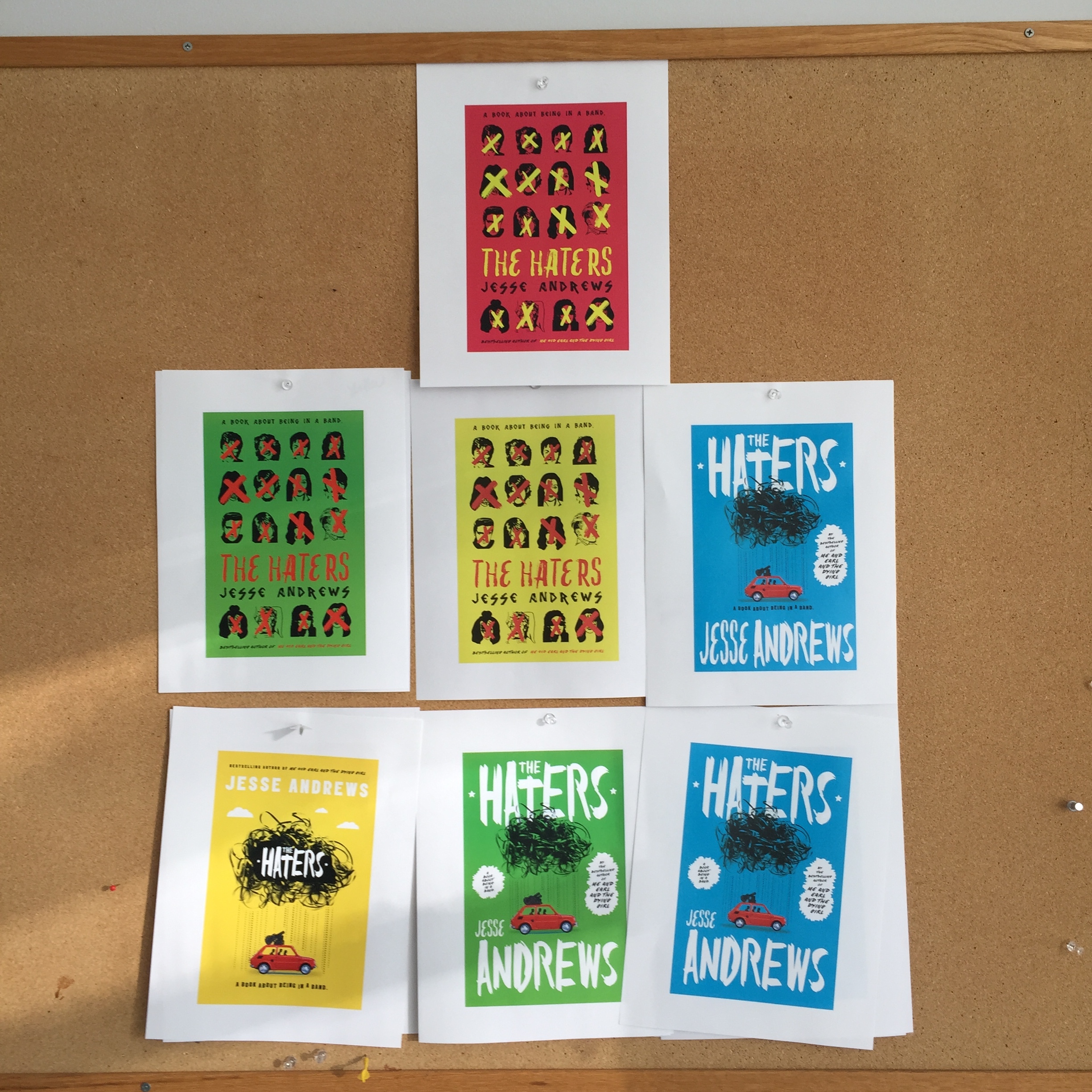
WILL STAEHLE: X'd out famous musicians/ May have to check on legality of this.
CWB: BAND: I fell in love with this idea immediately! I thought it was fresh, edgy and obviously graphic which was in line with the EARL approach. But could we do this legally? Time to ask some questions! In the meantime, we looked at more comps . . .


WILL STAEHLE: A "No" sign made up of musical iconography.
CWB: BAND: Meh! Not sure about this one.

WILL STAEHLE: Spoof of Velvet Underground cover. But it's an "unripe" banana since the haters are so "green" and young.

WILL STAEHLE: Spoof of Pink Floyd. But with goofy little musical triangle in the center and Spoof of Elvis cover and Clash cover.
CWB: BAND : I love these spoofs! So well executed but not really the vibe of the book in keeping with the series design for Jesse.

WILL STAEHLE: Teen made of headphone cord, with grumpy icon on headset
CWB: BAND : MUSIC : FRIENDSHIP: Well done, but kind a boring though but I dig teh headphones design.

WILL STAEHLE: Old beat-up tape with "hand-written" text.
CWB: BAND : Cool but just too retro

ABOVE: Here we have the 1st round concepts that we felt should be explored more.
ROUND 2 :
We tweak them!
In round 2 we spend time exploring a few compsfrom above to see .


ABOVE: We narrow down further
ROUND 3: Refinement
Until one direction comes forward from the others.
But more changes are needed. We cut some faces for more impact and immediate recognition.

But we felt we'd gotten too far away from, simple graphic on the EARL cover. And maybe this direction was too angry. Not funny and warm as the interior of the book.
So back to the drawing board.
BELOW: Are concepts that directly play off of the Me and Earl and the Dying Girl cover


But, these approaches were maybe too warm, not edgy, funny, "cool" enough.
Now is where Will and I started spit-balling completely new approaches. Our deadline was approaching fast . . . no pressure!
FINAL ROUND:
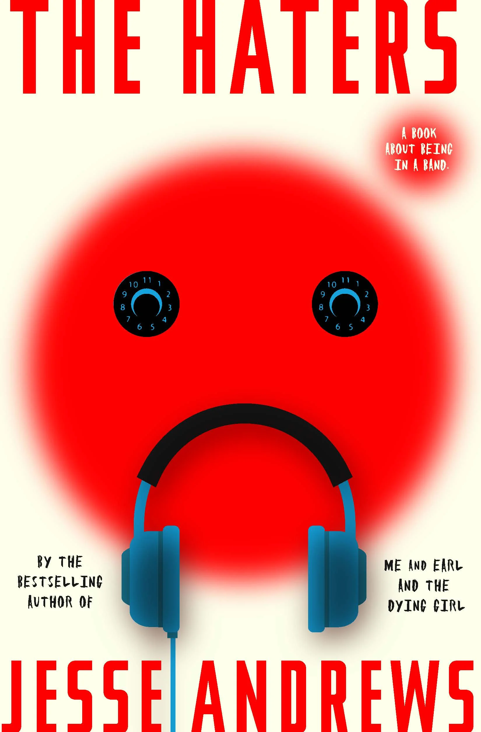
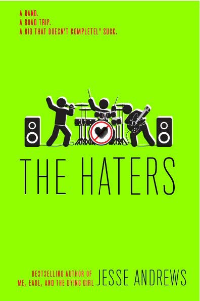
BELOW: The red dot Mr. Yuck face was funny, edgy and cool. But I passed over in the first round because the red dot face was off-putting and it didn't make any sense at the time. In the begin we were so focused on being edgy we forgot it was okay to be funny.

A few very quick tweaks to the design started to bring a simpler idea foward.

DONE!

Finally, we had it! A cover that looked amazing next to EARL and was funny, edgy, bright, warm and cool. And it conveyed music, bands, and the emotions of complicated relationships, ie any meaningful friendship. We LOVED IT!
A NOTE FROM JESSE ANDREWS:
CWB: Now that we have a cover what do you think of the end results?
JA: It's terrific. Very simple, eye-catching, funny but kind of elegant at the same time. I loved the Xed out faces and was a little sad when we pivoted away from them, but the final idea is even better. The SPINAL TAP reference (the amp dials go to 11) is sly and not overdone. And the bass on the case design! Oh my God, that thing is beautiful. It makes me want to retire a little bit. Just in the name of going out on top.
Me and Earl and the Dying Girl Next to The Haters.
FLAPS and ENDPAPERS
CASE DESIGN