AUGUST 7th : ILLUSTRATORS DRINK & MINGLE

Calling all illustrators, designers, art directors, and creatives!

You're invited to join us at Tailfeather in Clinton Hill on Wednesday, August 7th for a night of wine, charcuterie, low-pressure doodling, and community bonding IRL.

Feel free to BYOP (bring your own pencil/paper) if that's your jam. We'll have two reserved tables, if you want to carve out some personal space for you and friends we recommend showing up early.

**MOST IMPORTANTLY** We encourage you to mingle outside of your posse and leave room in your circle so people feel comfortable approaching and joining in. If you see folks who are left out or seem shy - say hello and invite them to join the conversation!

This is a public event open to all and a safe space for folks looking for some creative community. You don't have to be a drinker or self-identify as an illustrator to be welcomed - all creative, or creative-at-heart types are invited to join. RSVPing is not required but helpful to the bar to have an estimated headcount for staffing purposes.

Drink and Mingle Insta.jpg

History of Hale

On May 11th 2010 I was sent this short comic about Lewis and Clark in THE BOTTLE of THUNDER! This short comic became NATHAN HALE’S HAZARDOUS TALES.

Spring 2019 : BRIAN SELZNICK's LIVE OAK WITH MOSS

LIVE OAK, WITH MOSS

By Walt WhitmanIllustrator Brian SelznickAfterword by Karen Karbiener

As he was turning forty, Walt Whitman wrote twelve poems in a small handmade book he entitled “Live Oak, With Moss.” The poems were intensely private reflections on his attraction to and affection for other men. They were also Whitman’s most adventurous explorations of the theme of same-sex love, composed decades before the word “homosexual” came into use. This revolutionary, extraordinarily beautiful and passionate cluster of poems was never published by Whitman and has remained unknown to the general public—until now. New York Times bestselling and Caldecott Award–winning illustrator Brian Selznick offers a provocative visual narrative of “Live Oak, With Moss,” and Whitman scholar Karen Karbiener reconstructs the story of the poetic cluster’s creation and destruction. Walt Whitman’s reassembled, reinterpreted Live Oak, With Moss serves as a source of inspiration and a cause for celebration. 

ABOUT THE AUTHOR

Walt Whitman is one of the most beloved poets in American letters, best known for his Leaves of GrassBrian Selznick is the New York Times bestselling author and illustrator of The Invention of Hugo Cabret and Wonderstruck, among many other beloved books for children. Live Oak, with Moss is his first book for adults. He lives in Brooklyn and San Diego. Karen Karbiener is a Whitman scholar at New York University. She lives in Manhattan. 
 

The Cover Evolution of THE TERRIBLE TWO

This is the cover that was attached with the proposal. 

This is the cover that was attached with the proposal. 

Screen shot 2014-10-03 at 8.53.52 AM.png

Kevin Cornell's first character sketches for both Miles and Niles

First thing we need to work on is getting the characters just right. Can you tell who Miles and Niles are inspired by? Mac and Jory. At the bottom is the illustrator extraordinaire and grass eater Kevin Cornell. (sketches by Kevin Cornell)

Here Kevin tightens his sketches into more of a final form. Yep, he still loves grass!

Once the characters where worked out Kevin worked up a slew of different compostions. Above is one of the first that I received

Unknown-3.jpeg

DRAWING IS MAGIC : Silver Medal Illustrators 58 and CA AWARDS

Exciting News!


Drawing is Magic was awarded the silver medal for art direction and illustration at this year's annual Illustrators 58 exhibition from the Society of Illustrators. The award was announced at the opening reception for the exhibition on Friday night, with  author, illustrator and creative genius John Hendrix and myself on hand to accept the award. 

The Illustrators 58 exhibition features works by leading contemporary illustrators worldwide, selected by a prestigious jury of professionals. The exhibit will be on display February 3 through February 27 throughout the entire Society of Illustrators building (128 E. 63rd St, NYC).


Drawing is Magic has also been selected as a winner in Communication Arts Magazine's Illustration Annual competition, and will be featured in a dedicated spread in the May/June 2016 issue of Communication Arts (circ. 36,000), a professional journal for designers, art directors, design firms, corporate design departments, agencies, illustrators, photographers and everyone involved in visual communications. Drawing is Magic was selected from 3,973 entries. More info in the attached press release. 

CALDECOTT HONOR AND THE CORETTA SCOTT KING AWARD

BRYAN COLLIER TAKES HOME A CALDECOTT HONOR AND THE CORETTA SCOTT KING AWARD FOR TROMBONE SHORTY!!!

TROMBONE SHORTY by Troy Andrews, illustrated by Brian Collier wins ABRAMS first Caldecott award ever, the silver medal, as well as the Coretta Scott King gold illustration award. 

Bryan Collier IN NEW ORLEANS FOR JAZZ FEST 2015

Bryan Collier IN NEW ORLEANS FOR JAZZ FEST 2015

Tamar Brazis ( Editor ), Bryan Collier ( Illustrator ), Troy " Trombone Shorty" Andrews ( Author ), Chad W. Beckerman ( Creative Director/ Designer )

Photos from ALA

Summary Block
This is example content. Double-click here and select a page to feature its content. Learn more

Wimpy Kid meets the Pope

An incredibly cool moment... Mnsgr. Gallagher, who translated Wimpy Kid into Latin, hands the first copy to the Pope!

The Cover Evolution of ME and EARL and the DYING GIRL: Part 2 : The revised edition

I have no idea how to write this post….

 This is the story of Me and Will and the Revised Cover. 

Every book whether you are the reader or, in my case, the art director, becomes part of your life. Jesse Andrews’s Me and Earl and the Dying Girl left a big impression on me. The experience of working on the original cover was a deeply personal one, though just how personal I didn’t realize until I was asked to redo the cover for a new edition.

 When we heard the news that Earl had become a film that was taking Sundance by storm, I was so proud.  I loved the book and felt we had given it a really great cover. But success means change and the change that was coming was coming fast . . . From on high came the idea to update the cover to broaden the audience for the book. I was resistant. We had just three weeks to get a new cover to press and I had no clue what it should look like. I knew “broaden the audience” was code for making it look more adult, but that’s all I knew. But the impossible schedule and the lack of specific direction weren’t the real reasons I was resistant. I was personally attached to the old cover (below) in ways I was just realizing.

There are days that stick out in your memory. A particular day in the summer of 2011 sticks out in mine. My father was visiting me in Brooklyn, something he rarely had the chance to do. 

He and my brothers were driving around, checking out colleges, and had stopped over in Brooklyn for a quick visit. I made the most of the time and walked my family around my neighborhood. This was hard for my father since his diabetes made it difficult for him to walk for long periods of time. Most of the conversation that day centered around colleges, baseball, and pizza, until I got an email from Ben Wiseman.

Ben was the designer I had hired to work on the Me and Earl cover above. He had several comps he had worked up that I needed to respond to right away.  This gave me the opportunity to take my dad through the book-cover-making process in real time. I went over the problems Ben and I were trying to solve. To show three characters. To keep it graphic. To show a setting.  To keep it light though the book is about a girl dying…. I talked to my dad about what was working in Ben’s comps and what wasn't. Coming from a sales background, my father had lots of questions about who the book was for and how to get someone to pick it up if they didn't usually buy books. (I am still working on the answer to that latter question—we all are!) My dad wasn't much of a reader himself but said that if a book looked "entertaining" he would pick up. I try to keep that in mind on every project I work on to this day!

Here is an old post on the lengthy evolution of the original ME and EARL cover, which I worked on with editor Maggie Lehrman:

http://www.chadwbeckerman.com/chadwbeckermanblog/2011/12/me-earl-and-dying-girl.html

But it was on this particular day with my dad that all the pieces Maggie, Ben, and I had been juggling came together to form the original cover. It was also the last day I would see my father alive. Six months later he died from a heart attack.

 So I wanted to save that old cover. There was thought that the characters on the cover made the book look younger.

 OH, that's all?  Okay, I can do that . . .

EH!? Not so much.

The memories of that day and my dad’s advice about making it “entertaining” had stayed with me. The cover stripped of characters wasn’t entertaining! But now how was I going to separate my very personal attachment to the old cover from the need to direct a new one. GUH!

So I am battling my own reluctance, a project with no clear direction, and a crazy deadline. How was I going to make this happen? There was only one thing to do . . . don't do it alone . . . it was time to call . . .

WILL STAEHLE!

Will and I had worked together on three previous books. He’d given them a ton of great, creative approaches.  I sent Will a summary of the story, reviews, Sundance reviews, and the movie trailer.

ME AND EARL AND THE DYING GIRL will be released in theaters on June 12, 2015! Winner of the Grand Jury Prize and the Audience Award at the 2015 Sundance Film Festival, ME AND EARL AND THE DYING GIRL is the uniquely funny, moving story of Greg (Thomas Mann), a high school senior who is trying to blend in anonymously, avoiding deeper relationships as a survival strategy for navigating the social minefield that is teenage life.

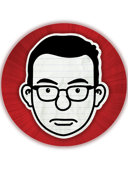
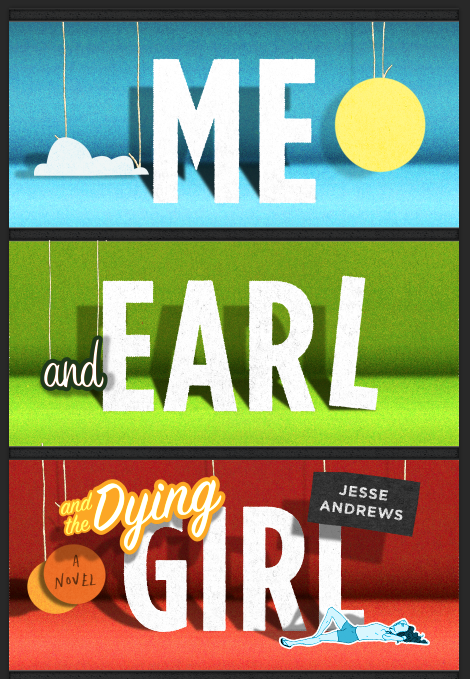
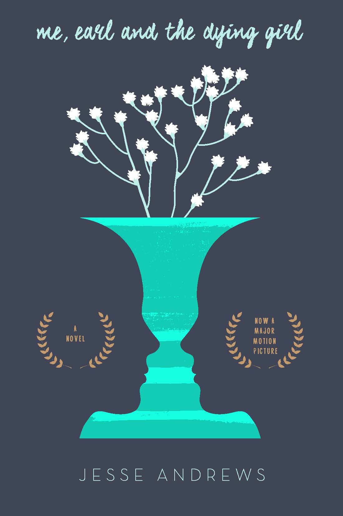
Art Director: Chad Beckerman :  So let's recap, what is ME and EARL and the DYING GIRL about?

Here’s the summary, written by editor Maggie Lehrman:

"Up until senior year, Greg has maintained total social invisibility. He only has one friend, Earl, and together they spend their time—when not playing video games and avoiding Earl’s terrifying brothers— making movies, their own versions of Coppola and Herzog cult classics. Greg would be the first one to tell you his movies are f*@$ing terrible, but he and Earl don’t make them for other people. Until Rachel.

Rachel has leukemia, and Greg’s mom gets the genius idea that Greg should befriend her. Against his better judgment and despite his extreme awkwardness, he does. When Rachel decides to stop treatment, Greg and Earl must abandon invisibility and make a stand. It’s a hilarious, outrageous, and truthful look at death and high school.

Publisher Susan Van Metre: Here is what the cover needs to convey: that this is the funniest book you'll ever read about someone dying, but that it's really not about someone dying.  It's about someone being forced to come alive. It's a kind of exquisitely funny and painful high school rebirth story

I’ll let Will describe his response:

Designer: Will Staehle: When Chad reached out to me about designing Me and Earl and the Dying Girl, I had just recently read about the new film (and it's impressive debut at Sundance). So I was more than happy to take the project on. That said, the cover schedule was a bit accelerated due to that very same Sundance buzz! I read through the book in one sitting, and really enjoyed the characters, the mood, and tone of it all. It's such an accessible book. It makes you think, cringe, and laugh all the way through. The book is also full of great visuals and scenes, so there was plenty of fun imagery to pull from.

This cover was certainly a balancing act. Chad had asked me to try and walk the fine-line between funny and sad. Now that's difficult enough…. Add to that a request to also balance the jacket between YA and adult and you have one very challenging assignment

Round one hangs on my office wall.

Art Director Chad Beckerman: We ran through a bevy of options. I quite liked the sock puppet comps, some of the various pillow comps, and the not-quite-right-for-the-book but visually fun double face/vase optical illusion. 

1: I liked the idea of the two faces ( Me, Earl ) and the flowers for the dying girl Perhaps too serious / severe, but I liked the look of it.

2: I thought the idea of the movie award-like laurel frames was a nice ode to the movie, and the movie making in the book, and the dying ones added a nice second glance sort of design wink to the cover, and reference to the story.

3-4: Pencil / eraser alludes to the school element / main characters ages and the loss.

5-6: Straight type treatment through a camcorder framework.

7: This started as a a diagram, and morphed into the three main roles.

8-9: The obligatory "movie" concept and a take on the Movie rating screen before films. Turned vertically.

10-11: The three main characters as sock puppets

12: Pillow comps. I think this is a pretty interesting cover, the large "blank space" in the middle of the jacket makes it memorable.

13: A "sad clown" cover. Referencing our main character's role as the "anonymous" student early in the book, and the personal "clown" to the dying girl.

20: A semi-random comp referencing Me, and Earl's friendship originally based around video games. ( I liked the two heart  and a bomb concept. ) 

Publisher Susan Van Metre: Hey, I think we are closer than you think. I think what we like about the pencil option is that the type in addition to that one small "prop," the pencil, tells a story.  The type looks like pencil writing--great.  That tells us that someone is being creative.  The pencil has an eraser.  The "Dying Girl" part of the type is being erased. That tells us that the creator is uncertain of his work, as well as telling us that someone is dying and that the book is cheeky about it.  In fact, I might be talking myself into that version!


Publisher Susan Van Metre: I think a type-forward cover is absolutely right I just wouldn't rule out the "type" being made from an object or being accompanied by a small prop--like the pencil or a reel of film or a pillow--to help the type tell a story.  This book isn't about Greg and Earl and Rachel being different sorts of people, which just using different fonts for each would convey. It is about Greg being too wimpy about himself and life to truly connect with others via friendship or his work. He's creative and funny but disconnected. The type definitely shouldn't be all connected!

 I like the Nick Hornby's, below, because part of Fever Pitch is made from a soccer scarf and is kicking a soccer ball.  High Fidelity is made from headphones. The A Long Way Down type looks like buildings. They are mostly type but communicate some aspect of the story via the form of the type or a prop.

 So, let's ask Will to work more on the pencil option he gave us. Could he also do something with a reel of film where it is spliced or shredded as it winds it way through the words of the titles.  Or could Me/Earl/Dying girl each appear on a cell of the film but with one in color, one in black/white, one in sepia? Could he try the title as dialogue in a script but their names are in color so they stand out? Let’s see more options!


Designer Will Staehle: This is what I came up with to address Susan's comments above

Art Director Chad Beckerman: Somewhere in between all of the above comps I was working on other approaches in case Will's comps didn't work out. I normally never take this approach but after talking with Will we decide in the interest of time it was best to cover all the bases. So I started working on type driven covers.

ABOVE: Ben Wiseman designed in 2011 for the hardcover edition. I thought it was worth resurrecting.

.

Video Block
Double-click here to add a video by URL or embed code. Learn more

Art Director : Chad Beckerman: But in the end there was one clear Will winner that kept making every cut. A cover that was serious yet funny. A cover that would appeal to both the core young adult audience and adults. I give you this final revised Me and Earl and the Dying Girl cover

Oh wait! Its not as funny as I was hoping. What can we do to fix that?


Ah! That's much better. 

Working on this project with Will and Susan has changed the way I work and what I thought I was capable of. I learned a lot from letting go, even of work that was very special to me. I am proud of the collaborative work that we did on this new cover, and in a very short period of time. I think my Dad would have been proud of what we came up with: I believe it’s a book he would’ve picked up.

Source: MEANDEARL

Vegetables in Underwear steps out

Every morning has its rituals. Scrolling through INSTRAGRAM is one of mine. On a spring morning a year or so ago I was scrolling through the daily photos with Rachel Poloski before starting the day. She was following Jared Chapman and came across the image below. I had known of his work previously but had not been following him on Instagram until the day I saw a broccoli awkwardly placing on his red underwear.

I mean come on! Amazing right? Psst . . . the answer is YES! 

I am always asked where do you find illustrators? I usually will say artist reps, society of Illustrators annuals, postcards and good old fashion research but now I can say Instagram. It's and amazing resource as an artist and art director. I love seeing artists process and finals. Not to mention the amazing access I have to see your work without having to do that much beside clicking follow. 

I immediately started showing the image around the office and started working on a  book concept.  How to turn this one hilariously weird image into a book was the task in front of us. After several hilarious fully clothed conversations with Jared we had something. Below is Jared sketches and then final layouts for VEGETABLES in UNDERWEAR

Sketch Draft

Sketch Draft

ABOVE: First color character sketch.

As you can see Broccoli is much different that in the sketch. We all agreed  he didn't look right. 

Final character and design layout

Final character and design layout

CWB: Hi Jared!

JC: Howdy!

CWB: This is the part of the blog where you tell us a little about what it was like to work on Vegetables in Underwear. Are you ready!?

JC: Yes, here is my big takeaway from working on this book (Which I've continued to use since):

My agent (Rebecca Sherman, Writers House) and I brainstormed ideas for the book and, once we had a general direction that we liked, I started putting pencil to paper. In the past I tended to work at a slower pace but in all of the excitement of the moment, I decided to try a different approach and work as fast as I possibly could. In hindsight, it paid off in two ways:
1. It kept the pacing and the energy of the story lively.
2. It didn't give me time to sit around and over complicate things.

We revised the dummy a couple of times and once we felt it was in good shape, we sent it over to Chad and Cecily. The quick pace carried over into production and the book- from manuscript edits to final art- was finished in a matter of weeks.

We finished the MS and interior art in a couple of months, right?

CWB: I think so. You where so fast and excited. Much like Pea.

JC: It seemed like it, but I couldn't remember exactly.
I'm usually very critical of my stuff, but this book is just silly and fun. From start to finish it was so much fun to work on. I think part of that was because of the silliness of the book but a larger part was because of you and Cecily. The two of you made the whole process exciting and enjoyable.

CWB: One last question, who is your favorite Veggie character? Mine is Pea. That kid is so much fun and perhaps should lay off the caffeine.

JC: Sheesh! Hard question. Probably broccoli just because I feel like I know him better since I've illustrated and animated him the most. But pea is a very, very, VERY close second because, how can you not love that guy, right?

First Color Sketch

ABOVE: The first color sketch of radish. We loved all the great color Jared worked up but I felt that there was too much color. I wanted to try and limit the color to only the Vegetables and the type. My hope was that we could use color to directly link the illustration and type.


Better! But now all the underwear is too boring. GUH!

More exciting for sure, but by having the underwear more detailed they started to look like pants and really lost what I loved about the simple underwear design that was in the first INSTAGRAM image I saw.

IT'S A POTTY TRAINING book with out a potty! Underwear EMPOWERMENT!

ABOVE: Rough layout sketch

So we simplified the underwear down to color. A line at the top is for girls and the flap line down the middle is for boys.

ABOVE: Final design

ABOVE: Front endpaper design. Wait! All our vegetable friends are sad? What will make them happy?

ABOVE: Back endpaper design. Phew! They love wearing just there underwear. Well except Potato and Pea. Oh Pea!

So what is Vegetables in Underwear about? Well, I’ll tell ya . . .a bunch of friendly vegetables wear colorful underwear of all varieties—big, small, clean, dirty, serious, and funny—demonstrating for young ones the silliness and necessity of this item of clothing. The unexpectedness of vegetables in their unmentionables is enough to draw giggles, but the pride with which the “big kid” attire is flaunted in front of the baby carrots in diapers will tickle readers of all ages. With rhyming text that begs to be chanted aloud and art that looks good enough to eat, this vibrant story will encourage preschoolers to celebrate having left those diapers behind!

LINK to Book Page: VEGETABLES in UNDERWEAR

The Art of Rube Goldberg: HOW THE COVER WORKS and more

The Art of Rube Goldberg (A) Inventive (B) Cartoon (C) Genius 


  Today's the day: After 7 years in the making, we're so excited to announce the release of The Art of Rube Goldberg! We're thrilled with the result, and we're sure you'll love it, too. Check out exclusive images, videos, cover details + more great features from the book on our blog #TheArtofRube #rubegoldberg

The Art of Rube Goldberg: HOW THE COVER WORKS