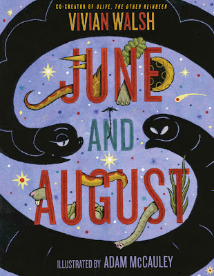
Spring 2019 : BRIAN SELZNICK's LIVE OAK WITH MOSS

LIVE OAK, WITH MOSS

By Walt WhitmanIllustrator Brian SelznickAfterword by Karen Karbiener

As he was turning forty, Walt Whitman wrote twelve poems in a small handmade book he entitled “Live Oak, With Moss.” The poems were intensely private reflections on his attraction to and affection for other men. They were also Whitman’s most adventurous explorations of the theme of same-sex love, composed decades before the word “homosexual” came into use. This revolutionary, extraordinarily beautiful and passionate cluster of poems was never published by Whitman and has remained unknown to the general public—until now. New York Times bestselling and Caldecott Award–winning illustrator Brian Selznick offers a provocative visual narrative of “Live Oak, With Moss,” and Whitman scholar Karen Karbiener reconstructs the story of the poetic cluster’s creation and destruction. Walt Whitman’s reassembled, reinterpreted Live Oak, With Moss serves as a source of inspiration and a cause for celebration. 

ABOUT THE AUTHOR

Walt Whitman is one of the most beloved poets in American letters, best known for his Leaves of GrassBrian Selznick is the New York Times bestselling author and illustrator of The Invention of Hugo Cabret and Wonderstruck, among many other beloved books for children. Live Oak, with Moss is his first book for adults. He lives in Brooklyn and San Diego. Karen Karbiener is a Whitman scholar at New York University. She lives in Manhattan. 
 

The Evolution of a NERDS book cover


"I imagine people will be surprised at how much work goes into this type of project. I'm surprised, and I participated in it!" —Ethen Beavers

The following shows the process Ethen and I went through working on the cover for Michael Buckley's latest series, NERDS. I wish I could have better descriptions but I don't want to give away all my secrets.

Step one find an Illustrator.
To find the perfect illustrator I teamed up with Michael and headed down to our local comic store, Rocketship  (sadly, now closed) on a cold January afternoon. We shifted through comics and graphic novels , compiling a list of ten names that we would present to our editor Susan Van Metre. In the end Ethen Beavers was the nerd for us. I tracked Ethen down by leaving a message on his art message board since all other searches came up flat. He responded which was a welcomed surprise.

I then sent him Michael's 2nd draft manuscript and a brief summary.

NERDS book description:
A secret spy ring of nerdy elementary school misfits
Combining all the excitement of international espionage and all the awkwardness of elementary school, NERDS, featuring a group of unpopular students who run a spy network from inside their school, hits the mark. With the help of cutting-edge science, their nerdy qualities are enhanced and transformed into incredible abilities! They battle the Hyena, a former junior beauty pageant contestant turned assassin, and an array of James Bond–style villains, each with an evil plan more diabolical and more ridiculous than the last.


Step two begin sketch phase

Ethen's first sketch


My first alternate compositional sketch. The idea was to introduce the all the characters.


Here the idea is the same but a little more realized. We added braces in the type. I add to a nerdy style as well as to highlight the main characters nerdy quality. This would be repeated through out the series. Only
there was something still not quite working.


We where forgetting the Spy angle to the NERDS story.
here are some additional sketches working out new compositions


The idea of and official seal came up.
Finally a font was chosen


Here we begin to work out color and how it will be used throughout a 6 book series


Next how to treat the type. I wanted a techie feel to the type as seen below.


Final type

But the seal still is working correctly. So we tried to nerd that up as well.
In the end it proved to be to much.


At last the color and composition is worked out.
Only something is still not working.


Again we needed more spy imagery. So we research James Bond and Mission Impossible imagery.
Ethen worked up these great sketches reworking the characters.


Ethen then combined the two ideas in to a final sketch


Then we took it to a cover meeting to see if we were on track.
Turns out we were!


Final art with out text.

Final Cover with text


Back cover design

Each book features a character. Book 1 features Jackson " Braceface" Jones, the new recruit. The fourteen pounds of metal in his mouth make him the team's go-to gadget guy!

One last bit a of business the CASE COVER! 

Did you know we designed the case covers for NERDS series with a different image than the jacket. I knew it you didn't. Who looks at the case cover anyway. GULP! I do.


Case Cover

The idea for the different case was to reveal the NERDS secret identities as normal kids. Apparently when they are not saving the world they also become fashion disasters.


Also in the NERDS series


About the book
Michael Buckley is at his comic best in this madcap new series sure to appeal to kids looking for a quick, exciting read.

Combining all the excitement of international espionage and all the awkwardness of elementary school, NERDS, featuring a group of unpopular students who run a spy network from inside their school, hits the mark. With the help of cutting-edge science, their nerdy qualities are enhanced and transformed into incredible abilities! They battle the Hyena, a former junior beauty pageant contestant turned assassin, and an array of James Bond–style villains, each with an evil plan more diabolical and more ridiculous than the last.

F&P level: V

Praise for NERDS
“An action-packed, tongue-in-cheek take on the world of superheroes and villains. The pacing is quick and the action is plentiful—kids will almost hear the sound effects as they read. NERDS brings a worthy message to the fore—that uncool kids can grow up to be anything but. Funny, clever, and thoroughly entertaining, this title should be popular.”
School Library Journal 

"The unique format of this book, combined with the imaginative and playful storyline, will appeal to many readers."
Children's Literature

About the author
Michael Buckley is the author of the New York Times bestselling series and Today Show Al Roker Book Club pick The Sisters Grimm. He has also written and developed shows for Nickelodeon, Disney, MTV Animation, the Sci- Fi Channel, the Discovery Channel, and VH1. He lives in Brooklyn with his wife, Alison, and son, Finn.


A for ABRAMS


We over here at ABRAMS KIDS have started a campaign on Instagram and Twitter called A for ABRAMS ( #aforabrams ) We are collecting A's that are artful, well designed, or just plain cool from anywhere that you might find them. The idea is whenever you happen to see one of these artful A's out and about you can join us by hash tagging your A #aforabrams as well as including our Instagram or twitter handle @abramskids or @abramsbooks.  Have some fun and we hope you all get to see the world around you a little better.

Here area few examples of different A's I have found.

You can find artful A's in our books!


From PANTONE COLORS designer by Meagan Bennett


From  I HAD A FAVORITE DRESS by Julia Denos

Or on your favorite wimpy book!


Or you can be crafty and make one to hang on your window.


Or you can find one in your local Museum!


 Found at MOMA


Or at your local bookstore!


Found at R. J. Julia Independent Booksellers in Madison, Ct


Or at your favorite restaurant!


Found at Prime Meats in Carroll Gardens, Brooklyn


Good luck hunting! A for ABRAMS #aforbrams @abramsbooks and @abramskids


DIARY OF A WIMPY KID 7: THE THIRD WHEEL cover revealed!


On Sale November 13, 2012


The title, cover, and first printing of book 7 in the Diary of a Wimpy Kid series are revealed today in a major press announcement! 

THE THIRD WHEEL is on sale November 13, 2012, and will have a projected first printing of 6.5 million copies. Please see the attached press release for details. NPR broke the news, use this link to see the story. http://www.npr.org/2012/05/31/153920909/june-kids-book-club-pick-diary-of-a-wimpy-kid
PW Children's Bookshelf quickly caught word, and other outlets have picked it up, including bostonglobe.com--more media outlets to follow tomorrow.

Also announced today is a major promotion with BOOK IT! Use link below.
In 1985, Pizza Hut established the BOOK IT! National Reading Incentive Program to motivate children to read more and help them develop a lifelong love of reading. BOOK IT! is a six-month program for students in kindergarten through sixth grade. For more information, visit www.bookitprogram.com. Wimpy Kid is the first branded character used in the program. This is a MAJOR promotion that will hit MILLIONS of children and provide invaluable exposure to a new generation of readers.

Evolution of Heart of a Samurai cover

About the book
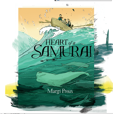
In 1841, a Japanese fishing vessel sinks. Its crew is forced to swim to a small, unknown island, where they are rescued by a passing American ship. Japan’s borders remain closed to all Western nations, so the crew sets off to America, learning English on the way.

Manjiro, a fourteen-year-old boy, is curious and eager to learn everything he can about this new culture. Eventually the captain adopts Manjiro and takes him to his home in New England. The boy lives for some time in New England, and then heads to San Francisco to pan for gold. After many years, he makes it back to Japan, only to be imprisoned as an outsider. With his hard-won knowledge of the West, Manjiro is in a unique position to persuade the shogun to ease open the boundaries around Japan; he may even achieve his unlikely dream of becoming a samurai.


With most projects I try to give the illustrator freedom to come up with there own concepts from which I will comment on. There are times when due to time or a very specific idea that this doesn't always work. But when it does I think this approach helps bring out the best work. in an illustrator Jillian is a prime example of this philosophy. She gave me more than I could have hoped for. Jillian's first round of sketches included five different approaches.


1
23

45
You got to love an illustrator that gives you so much to work with. Out of these five sketches the fifth really caught my eye. I was really excited about the possibility of spot varnishing the whales onto the cover. However after discussing all the sketches at a cover meeting we decided we wanted more action and less character based cover. After all this book is about the journey the character goes on. Jillian responded again with a variety of fresh ideas.


This was an exciting new take and gave us what the action we where looking for. But I felt that we needed a more centered composition. There was however several detail that I though could still be used. The tiny boat filled with sailors being tossed around by an angry sea for example. Also I the group really loved the giant whale tale. So as you can see from below we tried out a new composition based on these pieces


But still we were not quite there.


Jillian who I am sure was losing steam at this point mustered up this beautiful idea below.
Still the ideas of the angry sea versus the small boat was still on my mind as well as the whales from Jillian's first sketch that I liked. From those pieces we put together this sketch below.

Finally we were on the right track.


Jillian hand drew the type. It's important to be that the type and illustration work together. What better way for that to happen if they are both done by the same hand.

Next step color


Then full cover layout.


Spot varnish layout. All the black areas will be glossy and the white areas matte.


Last step add the 4 starred reviews to the back cover!


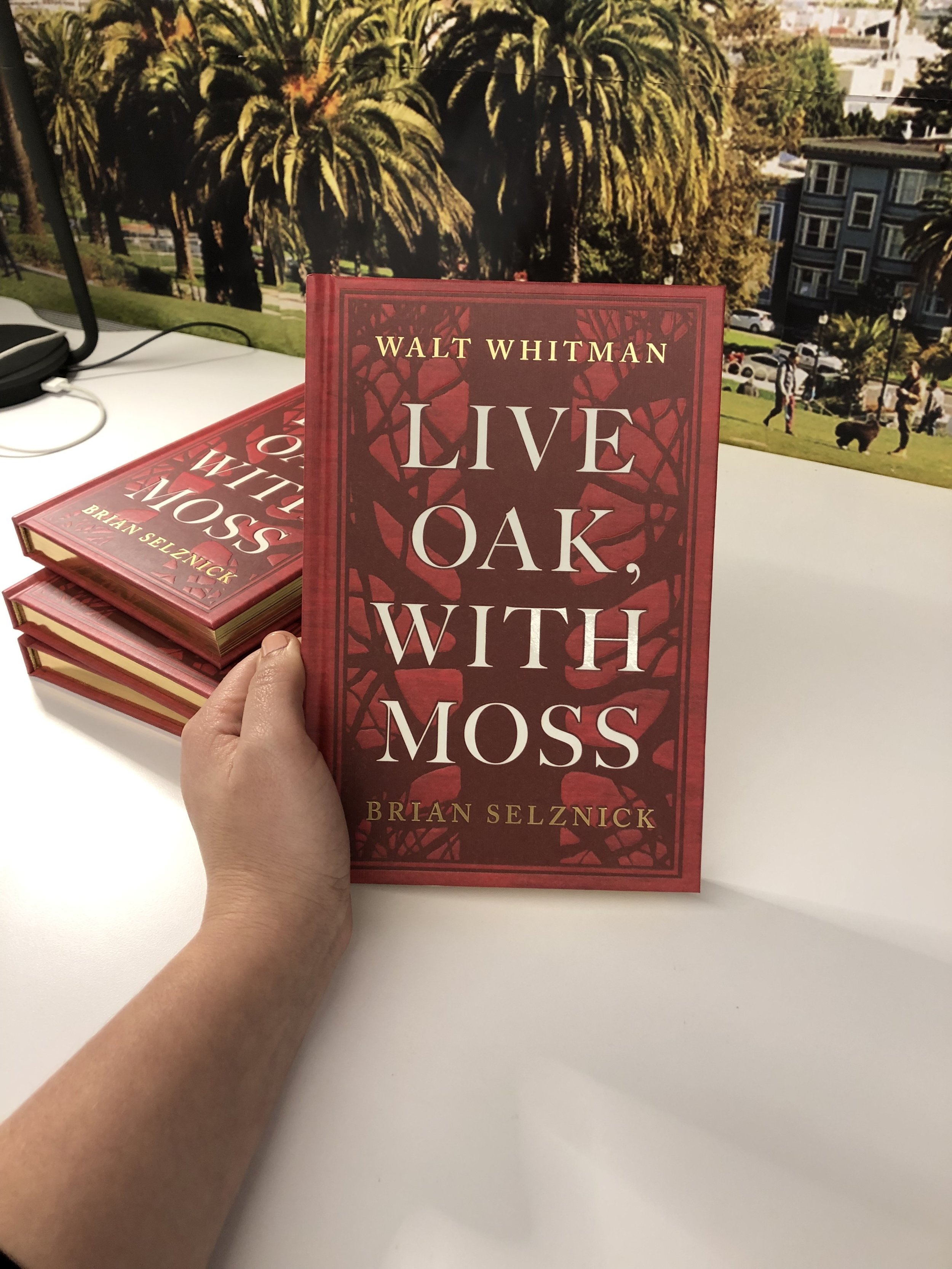
On another note Jillian just release INDOOR VOICE a collections of tiny comics, little drawings. pen, brush, ink, watercolor, and collage experiments that show how Tamaki arrives at her illustration work, as well as more polished and personal comics work examining her relationship to her parents and their influence on her art.


INDOOR VOICE
published by Drawn & Quarterly, August 2010
Softcover, ISBN: 978-1770460140


Authors: By Margi Preus
Imprint: Amulet Books
ISBN: 0-8109-8981-6
EAN: 9780810989818
Availability: In Stock
Publishing Date: 8/1/2010
Trim Size: 5 1/2 x 8 1/4
Page Count: 320
Cover: Hardcover with jacket


"A terrifc biographical novel by Margi Preus." -Wall Street Journal

*STARRED review from Booklist*

Manjiro is 14 when a freak storm washes him and his four fishing companions onto a tiny island far from their Japanese homeland. Shortly before starving, they are rescued by an American whaling ship. But it’s 1841 and distrust is rampant: the Japanese consider the whalers “barbarians,” while the whalers think of the Japanese as “godless cannibals.” Captain William Whitfield is different—childless, he forges a bond with the boy, and when it comes time for Manjiro to choose between staying with his countrymen or going to America as Whitfield’s son, he picks the path of adventure. It’s a classic fish-out-of-water story (although this fish goes into the water repeatedly), and it’s precisely this classic structure that gives the novel the sturdy bones of a timeless tale. Backeted by gritty seafaring episodes—salty and bloody enough to assure us that Preus has done her research—the book’s heart is its middle section, in which Manjiro, allegedly the first Japanese to set foot in America, deals with the prejudice and promise of a new world. By Japanese tradition, Manjiro was destined to be no more than a humble fisherman, but when his 10-year saga ends, he has become so much more. Wonderful back matter helps flesh out this fictionalized companion to the same true story told in Rhoda Blumberg’s Shipwrecked! The True Adventures of a Japanese Boy (2001).
— Daniel Kraus


*STARRED review from Kirkus Reviews*
In 1841, 14-year-old Manjiro joined four others on an overnight fishing trip. Caught by a severe storm, their small rowboat was shipwrecked on a rocky island. Five months later, they were rescued by the crew of a whaling ship from New Bedford. Manjiro, renamed John Mung, was befriended by the captain and eventually lived in his home in New Bedford, rapidly absorbing Western culture. But the plight of his impoverished family in Japan was never far from Manjiro’s mind, although he knew that his country’s strict isolationist policy meant a death sentence if he returned. Illustrated with Manjiro’s own pencil drawings in addition to other archival material and original art from Tamaki, this is a captivating fictionalized (although notably faithful) retelling of the boy’s adventures. Capturing his wonder, remarkable willingness to learn, the prejudice he encountered and the way he eventually influenced officials in Japan to open the country, this highly entertaining page-turner is the perfect companion to Shipwrecked! The True Adventures of a Japanese Boy, by Rhoda Blumberg (2001). (historical note, extensive glossary, bibliography.) (Historical fiction. 9-13)


*STARRED review from School Library Journal*
A Japanese teenager living in the mid-19th century bridges two worlds in this stunning debut novel based on true events. Manjiro and his fellow fishermen find refuge on a remote island after a storm destroys their ship. When they are rescued by an American whaleboat captain and given the chance to return home with him, Manjiro accepts the offer. His encounters with a land that he has been taught is barbaric and his subsequent efforts to return to Japan shape him into an admirable character. Preus places readers in the young man’s shoes, whether he is on a ship or in a Japanese prison. Her deftness in writing is evident in two poignant scenes, one in which Manjiro realizes the similarities between the Japanese and the Americans and the other when he reunites with his Japanese family. A sailor named Jolly and an American teen express the racism he experiences in America. Both of these characters gain sympathy from readers as their backgrounds are revealed, and as one of them comes to respect Manjiro. The truths he learns about himself and his fellow men and women are beautifully articulated. Manjiro’s own drawings are well placed throughout the narrative and appropriately captioned. Preus includes extensive historical notes and a bibliography for those who want to know more about the man and the world in which he lived.


*STARRED review from Publishers Weekly*
In picture book author (The Peace Bell) Preus’s excellent first novel, based on the true story of Manjiro Nakahama, Manjiro is 14 in 1841 when he is shipwrecked in a storm. An American whaling ship eventually rescues him and his shipmates, and while his fellow fishermen are fearful of the “barbarians,” Manjiro is curious about them and the world. Knowing Japanese law forbids him from returning home because he’s left the country, he learns English and whaling, gets a new name and family with the captain, and eventually seeks his way in America as the first known Japanese to set foot there. He finds innovative ways to challenge both hardships and prejudice, and never loses his curiosity. Preus mixes fact with fiction in a tale that is at once adventurous, heartwarming, sprawling, and nerve-racking in its depictions of early anti-Asian sentiment. She succeeds in making readers feel every bit as “other” as Manjiro, while showing America at its best and worst through his eyes. Period illustrations by Manjiro himself and others, as well as new art from Jillian Tamaki, a glossary, and other background information are included.
About the author
Margi Preus has written many popular plays and picture books for children. She teaches a children’s literature course at the College of St. Scholastica in Duluth, Minnesota, where she writes for Colder by the Lake Comedy Theater and also watches for whales on Lake Superior. This is her first novel. Visit her online at www.margipreus.com.

What did you do this weekend?

Well, I know what I did!


Friday night I attended a show at the Society of Illustrators called Blow-Up. Three illustrators with vastly different backgrounds: Tomer Hanuka, Yuko Shimizu, and Sam Weber. It is quite possibly the best show I have ever seen at the Society in quite sometime. If you are in the New York area, I highly recommend that you head over to 63rd street and Lexington and take a look.


Lauren Castillo chats it up.

Saturday was our neighborhood block party.


Where for some reason a neighbor asked if I want to judge the block Dog Show.
I could have said, "NO", but who turns down and offer like that? The categories were
1. Best dressed 2. Cutest 3. Most Unique. What kind of category is Most Unique anyway?

Remove Formatting from selection


I left the block party early to attend Michael Buckley's book party at
Powerhouse Books fro NERDS 2: M is for Mama's Boy.


Michael's son Finn was also in attendance
Later Saturday night I attended Illustrator | Rock Star gig at the Gun & Rod Club in Williamsburg


Marcellus Hall works on his set list


The drummer, Chris Raymond


Sunday, I took it easy.

I had brunch and a nice drink at Prime Meats.


Later I went on the hunt for a new book.


Did a couple drawings

For more Drawings click here
http://cwdrawings.blogspot.com


And then took in a sunset.


What did you do?

Evolution of the The Strange Case of Origami Yoda cover

A long time ago in a galaxy far, far away . . . .
Tom Angleberger sent me a small Origami Yoda


He sent chubby ones, some with faces and others without. Tom made dozens of different Origami Yodas. Searching for just the right one for the cover.

Below is a video showing how Tom makes his Origami Yoda.


As Tom searched for just the right Yoda. I began to think of how the cover might be laid out. Below is a 1st attempt sketch using the Star Wars font.


Only this seemed to obvious a direction. Yoda needed a face but how do you get a face from folded paper? The force was strong with Jedi Master Angleberger on this problem. A few weeks later Tom sent me this ( see below ) new and improved Yoda. Now with a light saber and crinkled brow!


Now that we had just the right Yoda. All that was left was to find the correct back drop. Since the story is set in a school the enviroment seem like a no brainer. We through around different ideas for the back drop. Crinkled paper? Lockers? Bulletin board? Final we settled on a chalk board. Which would also give the appearance of looking like space.

My thumbnail sketch ideaHow do you treat the text? Now that we settled on a chalkboard for the backdrop the font and how the text would be rendered must blend into the environment seamlessly. To prevent the text seeming like it was just laid on top of the design. Since Dwight, a loser, talks to his classmates via an origami finger puppet of Yoda. There seemed like only one solution to this problem

Solution: Thought Bubble and a font that looks like it was drawn on a chalkboard.

Next step: Designer Melissa Arnst worked up a thought bubble designs and photographed
a chalk board to get that school time atmosphere.


A font is chosen. Only the design is still not sitting well with me. The colors are to dull and the title doesn't command the space it is in. It's still missing some character.


Solution: Illustrator Jason Rosenstock. Jason using his vast illustration abilities, renders the type to perfection, tweaks the color saturation and drew little chalk drawings as well as a couple x-wings and planets.


And there you have it a perfect Origami Yoda cover! May the force be with you.


The book surrounded by 1,000 Origami Yodas
Italian Edition
About the book
In this funny, uncannily wise portrait of the dynamics of a sixth-grade class and of the greatness that sometimes comes in unlikely packages, Dwight, a loser, talks to his classmates via an origami finger puppet of Yoda. If that weren’t strange enough, the puppet is uncannily wise and prescient. Origami Yoda predicts the date of a pop quiz, guesses who stole the classroom Shakespeare bust, and saves a classmate from popularity-crushing embarrassment with some well-timed advice. Dwight’s classmate Tommy wonders how Yoda can be so smart when Dwight himself is so clueless. With contributions from his puzzled classmates, he assembles the case file that forms this novel.

About the author
Applying for a job as a newspaper artist, Tom Angleberger was mistakenly assigned to cover local government meetings. Fifteen years and countless town council meetings later, he is still writing instead of drawing, currently as a columnist for the Roanoke Times in Roanoke, Virginia. He began work on his first book while in middle school. Tom is married to author-illustrator Cece Bell. They live in Christianburg, Virginia.

Interview Adventure Series—Adam McCauley • 7


Adam McCauley enjoys illustrating, playing music, and making things. His illustrations have appeared in magazines, publications and campaigns world wide. Adam's work has been included in group shows in Osaka, San Francisco, New York, Tokyo and Nashville. He works out of his studio in the sunny Mission district in San Francisco.

Adam's clients have included Time, MTV, Apple Computer, National Geographic, Levi's, Viking, Harper Collins, Microsoft, and many others.

Adam's awards have included American Illustration, Society of Illustrators, Communication Arts, Print Regional Design Annual, 3 x 3, and How Magazine.

Adam received the Society of Illustrator's Gold Medal for his illustrated monster stamp endpapers for the book "The Monsterologist:A Memoir In Rhyme" by Bobbi Katz.


CW: My goal so far with the various interviews of illustrators is to help of illustrators find there way. The following questions will be add to this underlying idea. Let's get started!


CW: How would you recommend to other illustrators to get there work published?


AM: Do the best work you can do, make it as interesting to look at and experience as it is interesting for you to do. Good work makes for good work received.

CW: Do you have any rituals that you go through before you can get to work?


AM: Lots of procrastinating, usually.

I do the laundry,


paint the back porch,


go shopping.


Then, I pull up a cup of coffee,


turn on some music and buckle down.


CW: What process did you go through to develop your styles.


AM: When I got out of art school, I was broke. It was expensive to make promotional material, unlike now with cheap printing and email. So, I promoted using the neighborhood copy machine. I developed my style so that it would xerox easily, hence my work became high-contrast black and white. This just happened to be exactly what newspapers needed, so I was able to get a lot of work for local and National papers, which in turn got me into color work for magazines and eventually kid’s books.


CW: You have a variety of styles all equally good as the next how do you manage them. Do art directors ever get confused?


AM: The only person who has ever gotten confused about my work is my rep. A lot of styles makes marketing more tricky. I make a point when I’m hired for a job to ask what of my work they like and are responding to. On my website I name the styles to help people communicate their desired style. Some illustrators make actual alias names for themselves, but I always thought that was a bit goofy.


CW: What style did you use for JUNE AND AUGUST?


AM: My “Otown” style,
which is what I’m most known for, especially in kid’s books. This style matured when I was living in Oakland, California, hence the name.


CW: June and August is such and abstract text which leaves a lot up to the illustrator for interpretation. After first reading it what were some of your first thoughts on how to approach illustrating the text?

AM: It was an intimidating book at first for me, mainly because it was Vivian’s first book not illustrated by J. Otto Siebold, who is a god to me. After I got over that, most of it came together pretty fast. The most difficult stretch was were they go through the jungle and everything gets quite holographic. It was a bit tricky to draw it in a way that was clear.


CW: What did you find most challenging and most rewarding about working on June and August?

AM: I enjoyed how easy you are to work with! It’s been great doing some readings with Vivian as well, she’s very cool and it’s fun to hear her read and explain some of her experiences with all of her great books.


CW: Do you also have time to do your own personal work? If so what is it all about?

AM: I try to find time for personal work. Mostly, it happens while on vacation, in my sketchbooks. But at home I try and paint, always abstract – I get tired of representation all the time, and it’s good exercise to focus entirely on color and composition and picture-making. It informs the representative work. Also, I’m a pretty active musician ( http://www.adammccauley.com/music/cannonballs.mp3) – currently playing with three different gigging bands – I consider this personal work, which also informs the visual work and provides a nice social contrast to the insular world of drawing in a studio.


CW: What makes an extraordinary picture book in your eyes?

AM: Good art, good design, good concept, good writing. Sometimes books sneak up me.


CW: Who are your influences.


CW: What is next for you? Have you ever thought of writing as well?

AM: I’ve written one book, my first, “My Friend Chicken,” which is out of print. Maybe Abrams will re-issue? :-)


CW: I for one can't wait to see what you do next. Thanks Adam!


Here is a trailer Adam made for June and August. He even did the voice over!


About the book
This imaginative story explores the concept that the greatest friendships can come to be if you are willing to overlook differences.

Vivian Walsh is the co-creator of several bestselling books for children. In June and August she once again makes a misunderstanding the humorous but pivotal moment that brings together two very unlikely friends. One night in the jungle, June is thrilled to see a shooting star, while August loves looking at the moon. Although they can’t see each other in the dark, the two promise to meet again the next day. But when morning dawns, they face a dilemma. How are June and August going to recognize each other?


About the author
Vivian Walsh lives with her three children in San Francisco, California. She is the co-creator of several bestselling books, including Olive, the Other Reindeer. Visit her Web site at www.vivianwalsh.com. Adam McCauley also lives in San Francisco. He has illustrated a number of books for children, including the Time Warp Trio series, by Jon Scieszka, and The Monsterologist, by Bobbi Katz. Visit his Web site at www.adammccauley.com.

Authors: By Vivian Walsh, illustrated by Adam McCauley
Imprint: Abrams Books for Young Readers
ISBN: 0-8109-8410-5
EAN: 9780810984103
Availability: In Stock
Publishing Date: 9/1/2009
Trim Size: 8 1/2 x 11
Page Count: 32
Cover: Hardcover with jacket
Illustrations: 32 pages of full-color illustrations

Interview Adventure series—Julia Denos • 6


Julia Denos is the illustrator of DOTTY (FALL 2010) by Erica S. Perl. She doesn't have an imaginary friend of her own, but she does have a loyal feline friend, Serif, who is black with just one white dot on his chest. He doesn't like to wear a leash, but he follows her where ever she goes. Julia grew up in a the small Connecticut town of Cheshire. Oddly I too am from this same town.

Julia's little house in Cheshire, Connecticut (age 9 depiction).


CW: We all got our start somewhere . . . where did you go to school to learn your craft?

JD: My mom was my first teacher. She wrote songs, poetry, helped us put on plays, and encouraged creativity in every moment. We went to the Yale Art Museum often–I liked to stare at Hopper's "Rooms By the Sea"–and to the library to hunt for the books wearing Reading Rainbow stickers.


I was hooked on picture books. When school time came, I took every art class we could afford, and any offered in public school. I ended up in A.P. Studio Art in high school where Ms. Bednarczyk helped me prepare for art school. I attended the Art Institute of Boston for my BFA in Illustration.


CW: What courses or training were helpful in beginning a career in illustration?

JD: At AIB, it was important for me to take as many life drawing, color theory, and traditional media classes (like watercolor) as I could so I could build a strong foundation first, and worry about style last. My advice is: work hard, play and make a giant mess. Let go. Seek out teachers who will push you through a comfort zone into a new place in your art, who will REALLY critique your work. Take typography and design courses too, even if they aren't in your "illustration curriculum". Typography lives with your art in a book and it will be the bridge to the story you are illustrating.

CW: Besides illustrator, what are other jobs you have had?

JD: I've worked at a daycare, florist, children's bookstores (The Alphabet Garden in Cheshire, CT and Curious George in Cambridge, MA), AIB's slide library, one full day as a store-front mannequin dresser.

CW: How long after school did it take to get your work published?

JD: I signed my first contract with a publisher the year after school, and my first book, an early reader about Sojourner Truth, came out later that year.

CW: Do you have any rituals that you go through before you can get to work?

JD:
1.Breakfast!
2. Email
3. Hide and seek with cat (above)
4. Yoga
5. Music/talk radio
6. Coax napping cat from artwork (page 12 of Dotty below)
7. START! I can't work without audio. Sometimes I listen to old movies while I work, I just had "Harvey" on last night, but my Audrey Hepburn collection is in rotation right now.


CW: Every illustrator finds inspiration from somewhere. I for example look always go on walkabouts to focus and be inspired by exploration. What inspires you?

JD: Possibility, picture books, words, messy children, libraries, bookstores, fellow artist blogs, the Boston cityscape (home), classic Hollywood, vintage fashion, runway magazines, ethnic costume, all things historical, scientific, spiritual, ghost stories, passed-down family tales, antiques, music, nature, and COOKING. Something about experimenting with ingredients unlocks part of my art brain when I hit a block. I invented a recipe for mascarpone cheese brownies while working out the Dotty dummy. I would LOVE to illustrate a cookbook!

CW: How would you advise other illustrators on getting their work published?

JD: Have your work ready to go and believe in it, always be reinventing it. Follow it to where it needs to be (look in bookstores and libraries and magazines for clues). Network, attend events and have an online presence, be it blog or website. Let your art be seen and seek constructive criticism. Some illustrators opt for an agent to help promote their work to publishers but it's up to you!


CW: You have illustrated numerous books so far in your young career. Do you see yourself writing in the future?

JD: Yes! I would love to very soon. I've been writing all my life, but I am very careful with it and a little shy. I put my stories away until art school was finished. They are surfacing again and keep popping up on scrap paper, so, yes, things are underway in that department.


CW: When developing Dotty where did you come up with the concept for Dotty?

JD: I was in a coffee shop, sipping something too sweet and eavesdropping on a conversation next to me, doodling on a stack of paper. By late afternoon, Dotty and Ida's characters transformed many times. I just let Dotty do her thing. Here is some concept work for both characters (click to enlarge images!)
Dotty and Ida's FINAL FORM (above)


Author, Erica Perl, sent me amazing pages of her own sketches of what she thought Dotty looked like. I loved her little goat concept (above). I took her lead on the horns!


CW: How did you develop your style?

JD: I just took my art education and pushed and pulled what I wanted out of it. Like many artists, I began as a hyper-realist, and drew mechanical still life and rendered figure drawings per my traditional classes before I loosened up. When I was finally making work that looked more like the "style" I have today I was a senior in art school, and created my last painting of a little girl and a rabbit, "The Cinnamon Rabbit". She became a jumping off point.

Once I began to get illustration jobs out of school, is when I really had style overhaul. It's only recently that I am finally loving some of it and I feel like I'm finally there, at the starting point. This is due not developing a "look" but happened with little steps toward embracing freedom and joy within any job, in various styles. It is also an extreme blessing to get an art director or editor who assists you in letting go, urges you past your own limitations, and waits with you to see what happens. Having the confidence of an art director/editor is being able to run with the manuscript into your happy place!

So long answer short, maybe my "style" is finally here. It's the best place to be: I have the struggle behind me and the messy possibility ahead of me, and tons of room to grow and improve.

CW: What about your style are you still learning as you approach a picture book project?

JD: That I have to let go. Style for a book can't be forced, it has to be an intimate real relationship with the text. Each book and story has a voice that translates into a mode of line and color palette and certain degree of realization or stylization. I read a manuscript and listen and imagine and wait to "see" it. Sometimes I immediately see everything clearly, but other times I can't see the story until late in the game, and I have to be patient with myself.


Dotty switched styles a few times right up until the end. I played with line weight a lot in Dotty, using childlike line and intentional line together, because of the nature of the story. I am learning to block out mental direction and go with the gut. This requires lots of balancing between intention and happy mistakes. It's thrilling when you have no idea what might happen next.

CW: Do you also have time to do your own personal work? If so what is it all about?
JD: I squeeze in sketches when I can. Usually my personal artwork involves me plugging into music, entering the zone and leaving with a big experiment. My goal is to always bring what I learn from my personal work back into my narrative work for clients. I need to constantly be developing as an artist and pushing my style limits to keep my client work fresh, to keep me feeling alive. I am currently teaching myself to loose control while maintaining recognition and life in a character. Things are getting sillier.

My personal work is character centered and about breaking rules. I love pushing the paint out of the lines in flat shapes, but teasing the render line back toward reality. Or mixing odd eras of clothing and time periods to pull something new from the character. Fashion is such an important element in storytelling to me. It is more than costume, because it denotes that character's choices, reality, and beliefs.

I am always wanting to push the limits on time period too. I think the way we view "time" is way too linear (my dad is a major sci-fi/time-travel buff, so that probably explains a lot), and I guess I see time as another rule that can be broken on paper with imagination. It's another facet of character to be played with. I want to push the limits on how we think of who we are and when we are from, and why those things are important to the story we are a part of.

CW: Is there a difference between illustrating a “celebrity book” versus illustrating a professional children’s book author's text?

JD: Based on my recent experience with this (illustrating My Little Girl) I found the differences fell more in the realm of the production of the book...there was an extra team of people attached to the celebrity, through which my work had to be approved. Luckily, I was given ample freedom in my style for the book, which I am grateful for. I enjoyed making art for it, Tim was gracious and I definitely learned a lot from the experience too.


Another difference is the third element beside author and illustrator not always present in picture book creation: the celebrity factor. Good and bad can come with this. There is dangerous potential for the focus to be only on the name branding of the book and the marketing alone, rather than caring for the written and artistic content, sadly making the book into more of a "venue". A celebrity name may generate sales for a while, but substance is what will make it stay on the shelves. I respect the picture book as an art form. I respect its creators, both celebrity and non celebrity, but what's inside the jacket must be held to the same unwavering standard, no matter whose name adorns that jacket. A successful celebrity book will have its heart in the right place.


CW: What makes an extraordinary picture book in your eyes?

JD: A work of art and literature, a trip, a teacher, a friend and home rolled into one square little thing. An extraordinary picture book allows a person of any age to open it, go to a new place, close it and leave, without the book ever really leaving them. Picture books are not just for children either! Amazing things happen to adults when they read them. Good picture books are like friends, ones that you will visit with many times, and even search a lonely bookstore for no matter how old you grow to find that exact book, even when you've forgotten its name.

When I worked in the bookstore, adults were always coming in and asking for a book from childhood that had a “cat that maybe went on a trip, and the colors were all yellow and red, and there were tiny houses in the background...do you know the the name of it? I've been looking for it for years!” That's a powerful thing!
CW: What is a book that has blown your mind lately?

JD: Madeline! I recently fell in love with Ludwig Bemelmans. Like many, I grew up with his books all around me, but this fall it just clicked. I started to see his work with fresh eyes. You can tell from his spontaneity that he trusted his art making. He respected his audience and children with his art. His work seems to be so joyful and tongue in cheek all at once. It encourages me to be more free in my own work. Miss Clavel and the girls have been good studio company lately.


CW: Have you seen Werner Herzog Read Madeline?


JD: YES, I love that Werner Herzog video. Best line is about the vines: "The Norman forest trying in vain to reclaim its ancestral land." I laughed for a good while about that. And poor stifled Ms. Clavel.


CW: Have you ever had an imaginary friend?


JD: No! I was jealous of my younger sisters who had REAL imaginary friends (named Plo-Kla, Kuddongs, Lion and Flea-hat) So I drew my own imaginary friends one day and decided to have two fakes. “Doodie-Dye” was a purple and furious looking squiggle with a bow (similar to Katya's in Dotty-see below) and “Noonie” was a banana with eyes . . .


It’s Ida’s first day of school. She carries her new lunch box and a long, blue string with her special friend Dotty attached to it. A big, colorfully spotted pal with horns, Dotty just happens to be invisible. On that first day of school, Ida and Dotty find out there are plenty of other imaginary friends in attendance. But as the year passes and fewer and fewer imaginary friends come to class, Ida begins to wonder if Dotty is welcome at school anymore . . .
Perceptive and warmly funny, with charming art from exciting illustrator Julia Denos, Dotty is a celebration of the power of friendship and imagination.


Case cover back and front


Endpapers


Interior


For more Behind the scenes of
DOTTY with Julia Denos
Click Above

Evolution of the MEANWHILE cover


Original hand-printed version of this "insane choose-your-own-adventure masterpiece"
—Scott McCloud


About MEANWHILE


Chocolate or Vanilla? This simple choice is all it takes to get started with Meanwhile, the wildly inventive creation of comics mastermind Jason Shiga, of whom Scott McCloud said “Crazy + Genius = Shiga.” Jimmy, whose every move is under your control, finds himself in a mad scientist’s lab, where he’s given a choice between three amazing objects: a mind-reading device, a time-travel machine, or the Killitron 3000 (which is as ominous as it sounds). Down each of these paths there are puzzles, mysterious clues, and shocking revelations. It’s up to the reader to lead Jimmy to success or disaster.

Meanwhile
is a wholly original story of invention, discovery, and saving the world, told through a system of tabs that take you forward, backward, upside down, and right side up again. Each read creates a new adventure!


I first met Jason Shiga in a large ABRAMS conference room in the summer of 2008. At this point I was familiar with Jason's work on Bookhunter and had just finished his first original hand-copied version of Meanwhile. (pictured above). It was and is unlike any graphic novel I had ever seen. Jason graduated from the University of California at Berkeley with a degree in pure mathematics. "I have a pretty analytical mind, so I think solving a puzzle is about the most exciting thing a reader can experience," he told us. The amount of work and thought that went into this book is staggering. Time online said that Meanwhile is funny, disturbing, thoughtful, deconstructed, and cleverly put together. So I knew that I had a lot to live up to to help make this book look amazing.

Editor Maggie Lehrman made this dummy below in the style of Meanwhile to give to Jason at our meeting.


Meanwhile's cover would be unlike other book designs that I have worked on purely because there wasn't one story to follow and base the cover on. So we needed to come up with an overall theme to represent all 3,856 stories. ( Jason actually counted all of them. May I remind you that he is a math major) Jason's original cover was in black and white and had elements that we liked, but it wasn't quite to the place that we wanted. So . . . first step, Jason took some time and worked up various cover ideas to begin discussion.

Stage 1


There were several things we found very intriguing about these comps but again, none felt right. After talking with ABRAMS ComicArts executive editor Charles Kochman about these comps, he kept coming back to one overall theme of Meanwhile, "search or struggle to find home." Going forward this would become our mantra.

Stage 2

"Search or struggle to find home"

These comps show the response to our mantra as well as a the idea that the title type could be an extension of the interior tubes. In these first couple comps the type begins to take form.

Stage 3

After sitting on the cover for a week to reflect, we began to realize that we needed and iconic image of the main character to introduce him. Of course the word iconic is always in the back of my mind as the end goal for a cover. So we worked up these comps to help further along the idea of finding home as well as integrating the type into the art.

With both of these sketches I tried using the idea of panels and tubes from the interior extending from the Meanwhile type to create a story to show the main character's search for home.


I let the above sketches sit on my bulletin board for a few weeks. I knew that there was an idea there but it wasn't completely realized yet. I knew that I need to tie in the ideas of the interior into the cover. At this point we began to receive in final art for the interior. Jason's art help me become inspired. I poured over all the color layouts and began to cut out certain panels that helped tell our story of a search for home.


Stage 4

Below are Jason's responses to the above comp

Above he is riding a giant squid


I think we are on to something here.

At this point we felt that we were headed in the right direction as far as the idea and composition. A few more elements needed our attention. Color, type and size of the main figure didn't seem right yet.

Stage 5

1st color Shiga version


Stage 6

Final color

Stage 7

Adding a back cover and spine that match the "look and feel" of the front cover as well as the entire world of the book.


Behind Jason Shiga is a layout map of the entire Meanwhile book.


Meanwhile
Pick Any Path. 3,856 Story Possibilities.
Meanwhile
see larger photo
Authors: By Jason Shiga
Imprint: Amulet Books
ISBN: 0-8109-8423-7
EAN: 9780810984233
Availability: In Stock
Publishing Date: 3/1/2010
Trim Size: 7 1/2 x 9
Page Count: 80
Cover: Hardcover
Illustrations: Tabbed pages; full-color illustrations throughout

100 Scopenotes BLOG interview


CLICK HERE FOR FULL INTERVIEW

I was just interviewed by the blog 100 Scope Notes. Travis Jonker my interviewer is an elementary school librarian since 2005, started 100 Scope Notes in the golden days of 2007.

In addition to posting children’s literature reviews here, Travis also periodically straightens his tie and reviews for School Library Journal, and has been a judge for the Cybils Awards.

He lives in Michigan.


Hope you enjoy the interview it was a lot of fun to do.


On Press in Hagerstown, Maryland for the DIARY OF A WIMPY KID: DOG DAYS cover

A few weeks ago I traveled down to the Lehigh Phoenix Color plant in Hagerstown, Maryland for an on press check of the cover printing for DIARY OF A WIMPY KID : DOG DAYS. My main goal was to make sure that the color yellow was printing correctly. It was!


The Evolution of the 3-2-3 Detective Agency Cover


in The Disappearance of Dave Warthog
By Fiona Robinson

One of my favorite books on the Fall 2009 Amulet list is 3-2-3. I have talked about evolution Michael Buckley's NERDS in dept and will soon be posting about Lauren Myracles Luv Ya Bunches but right now its time to take a look at the evolution of the 3-2-3 cover design.

First a little bit about the book
Fast-paced, full-color, and divided into short, easy-to-read chapters, this is a wonderful graphic novel for younger readers, offering a seamless transition between picture books and novels.

On the 3:23 Express to Whiska City, five unlikely friends meet and decide to form a detective agency. There is Jenny the wise donkey, Roger the gourmet dung beetle, Priscilla the theatrical penguin, Slingshot the hyperactive sloth, and Bluebell, the shy but brave rat. With little training but a lot of pluck, they set up shop in Whiska City and soon tackle their first mystery: a rash of disappearances linked to a pink poodle’s beauty salon.

A funny, clever detective story for young graphic novel fans!.


On one of Fiona's many enjoyable visits to our offices she dropped off these 2 pulp comics, AMAZING STORIES. Which I took some direct and indirect influence from. The trick was to introduce the characters in a pulp comic setting while remaining true to the Fiona's voice.
Here are three of our first attempts.

We all loved the humor an wit of Fiona's characters along the spine but how to make the type work was still and issue.


In all three of the above the title type was a problem. No matter what we tried the design forced us to put the copy in a box which just didn't seem to work. Also, it became repetitive to show all five characters along the spine and in the main image. There were to many parts, to many things going on. Below is an attempt at simplifying the above ideas.


This direction seem to click at the time. We liked it enough to present it and the other ideas at our weekly cover meeting for discussion. The conversation in the meeting turned to a confusion over why the monkey was hypnotized and whether this was the image that was best for the book. We also talked about what was more important, introducing the characters or telling the audience that this is a pulp mystery graphic novel. At the moment we were displaying all these ideas yet nothing was working 100%. So we were sent back to the drawing board.

Almost a month went by before I was able to take another go at rethinking the design Luckily we were ahead on this book so I had time to waste. But more importantly time to step back and take another look from a far.

Knowing what we needed to be on the cover helped going forward.
1. Introduce the characters
2. Pulp comic design influence
3. Simple design/Iconic Image
4. Communicating that the book is a mystery.
5. Setting up a design for a possible series if needed.

On a rainy Thursday afternoon Fiona and I sat down in my dark office and I sketched this up while listening to Fiona's ideas.


We wanted to somehow keep the circle character drawings from the first cover comps. Can any one say BACK COVER?!


Fiona's Final cover art


Back cover hand drawn text

Paperback textBack cover hand drawn text

Hardcover text


Back cover text plus illustration

A needed graphic element hinting at a mystery and an important plot point.Final cover design.


Final Paperback design
Final Hardcover with Flaps design


FIONA ROBINSON
About the author
Fiona Robinson is the author-illustrator of The Useful Moose: A Truthful, Moose-full Tale. Publishers Weekly praised her “flair for humor tinged with heart.” Her work has been honored by the Royal Academy of Arts and been featured in many gallery shows. She lives with her family in Brooklyn, New York.

Available in two editions:
Paperback, and hardcover with jacket

SPECIFICATIONS FOR BOTH BOOKS:
80 pages, full color, 6 3⁄4 x 9 3⁄8"
PAPERBACK ISBN: 978-0-8109-7094-6
HARDCOVER ISBN: 978-0-8109-8489-9
US $9.95 CAN $12.95 PB
US $17.95 CAN $23.50 HC

Scenes from my Bulletin Board•Part 1


I thought it would be interesting to post a photo of my bulletin board in my office once a month to see what I am working on. I usually post up covers that I am designing or art directing to 'live with them' for a while an see if they are working. Some titles on my board are The Strange Case of Origami Yoda, Meanwhile, The Popularity Papers, Attack of the Fluffy Bunnies, Fizzy Whiz Kid, Sisters Grimm, Bear In the Air and Anxious Hearts. The beginning of every month I will be posting "Scenes from my Bulletin Board". I know . . . you're excited.

WIMPY KID DOG DAYS: ICE CREAM TRUCK


Designed by Jeff Kinney and Chad W. Beckerman— Our first Ice Cream truck design.

In keeping with the new book’s summertime setting, a custom “Wimpy Kid” ice cream truck will visit 40 U.S. libraries over the course of 30 days beginning August 3, promoting “The Dog Days of Summer Reading.” Beginning in Sacramento, Calif., the truck will wind its way through California, Nevada, Arizona, Kansas, Nebraska, Iowa, Illinois, Ohio, Pennsylvania, Washington, D.C., Virginia, Maryland, New Jersey, New York and Connecticut before ending its tour in Boston, Mass. Additional tour details are available at the Wimpy Kid Web site.—Publishers Weekly


WIMPY KID ICE CREAM TOUR TRUCK. IS IT COMING YOUR WAY?
Check the map.
Click Here.

Behind the scenes of Dotty with Julia Denos and Erica Perl

The Making of Dotty by Erica S. Perl illustrated by Julia Denos
Part 1

Here is the origin story on DOTTY by Erica Perl, author:

EP: When I was a kid, I had imaginary friends. I told my parents that two of them were twins but were not the same age (which they found funny, though I didn't understand why for years) and their names were Sahti and Dahti. I was probably about three or four at the time, which I know because we moved to Rhode Island when I was four and these memories predate the move. I also had an imaginary pet (a sheep) when we lived in Vermont, where we didn't move until I turned eight. But by then I was pretty sure that I'd get teased if anyone found out about my imaginary sheep, so I didn't tell anyone. I think the initial idea for DOTTY came out of both of these experiences: having an imaginary friend that interested and amused others, as was the case with Sahti and Dahti, and having an imaginary friend that might be a source of ridicule. And, of course, the name "Dotty" came from "Dahti."

On writing the manuscript:

EP: When I first wrote the story, I relied on this memory I have of overhearing a girl gossiping about me to a friend and the friend replying, "Who's Erica?" And then the first girl pointed me out by saying, "Hey, ERICA, I like your sweater." But when I went to storyboard out the book, I was surprised by the intensity of Ida's —and Dotty's —reaction. This sometimes happens when I write a piece… it is much neater in word form, but if I start sketching and drawing, ideas flow and things happen. It's why I always encourage writing students to draw, even if they don't want to be illustrators. Sometimes you don't know what you want to say with words until you get an image.

Erica Perl on the evolution of Dotty:

EP: When my draft of the manuscript was finished—long before Julia was selected as the illustrator—I started reading the story aloud as part of my author visit presentations. I'd ask the kids to raise their hands and tell me what kind of animal Dotty was. And the kids would tell me: she's a bull! she's a goat! she's a giant guinea pig! So I realized for the first time that maybe Dotty was an animal unto herself . . . or a one-of-a-kind combination of many kinds of animals.

On selecting Julia Denos:

CW: It was actually kind of hard. Erica Perl ( author) remembers talking with Susan Van Metre and telling her here ideas and hearing hers. We were on the same page, both of us wanting someone who could capture the whimsical qualities of the piece without making it overly sentimental or losing the humor and range of emotions. Julia Denos was my pick among other. On a rare occasion do i find and illustrator from a mailer. Yet this is how I cam across Julia. Erica recalls checking out her online portfolio (after I sent here Julia site to review ) and thinking "YES! Oh please let us get HER!"

FOLLOW Julia at here Blog http://www.thecinnamonrabbit.blogspot.com

You might remember Julia Denos's work from Tim McGraw's picture book My Little Girl.


So we begin. Julia and I worked out a time table for sketches and final art as well as other contractual items.

Here are Julia's first sketches


Video Chatting over sketches.


"During Choice Time, Ida found out there were even more in her class. Pete and Repeat came to school with Max. They were twins, but not the identical kind.
Kay was Benny’s. She had razor-sharp teeth, but Benny swore she would never really hurt anyone. Beeku was tiny. She swung back and forth on Katya’s braids, chattering all day long.
And there was Dotty. Who kept mostly to herself, nibbling the rug. "

First round character and layout sketches

Ida Brunnette . . .


or Ida Blonde?

DOTTY character sketches

She started out as a gremlin on a leash
and slow began to look more like a buffalo
then more cow like


Other Imaginary friends


Page layouts
Final Dotty Character Sketch
NOW GET TO WORK DENOS!